I feel that my work is akin to two Modernist movements: the Bauhaus and Cubism.
Bauhaus
The Bauhaus, specifically in typography and graphic design, presented solutions of making clear type through Modernist thinking. There exists this idea within Bauhaus philosophy of having type and placement that is clear, preferring to have simple shapes and forms, choosing to stay away from centered type and instead using less conventional layouts. The Bauhaus is marked by having geometric forms and having a place in relation to technology in a changing world. Many of my typographic works reflect these aesthetic ideas, while also moving towards these ideas with much of my work and meaning looking towards the developing future. Joost Schmidt's "Poster for the 1923 Bauhaus Exhibition in Weimar" uses these elements.
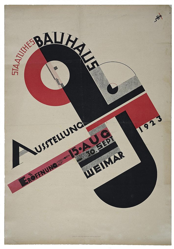 |
| Poster for the 1923 Bauhaus Exhibition in Weimar, Joost Schmidt, 1923 |
Though many of my works do not specifically go to Bauhaus values, much of my graphic design works refer to them, integrating some Bauhaus ideas into my own evolving style. It is also important to note that I do follow and believe in the idea of "bold" design; this is true of many graphic designers and it is true to me, the idea of using strong contrast to catch someone's eye regardless of topic is something that I try to take advantage of in my work. Typography and posters from the Bauhaus are marked by creating "functional" pieces that display information in a way that strays from more classical thinking, with my own experimentation at times leading to similar results.
 |
| Futura Type Specimen Poster, Rocco Francisco, 2024 |
Cubism
Cubism is something that I draw inspiration from, as some of my works can be described as deriving from cubist works. When I am not working on commercially motivated graphic design works, I tend to work with silhouettes and geometric shapes to explore themes of self reflection. These pieces typically use triangular shapes or simple forms with simple but distinct color selections to allow the audience to relate the works to themselves through ambiguity. One piece that can be related to my works is that of Picasso's Girl with a Mandolin, which uses geometric forms and a simple color palette to imply a figure instead of painting it outright. This can be related to works I've referred to before in this course due to the usage of geometric forms to imply shapes, though they are not always distinguishable objects.
%2C_oil_on_canvas%2C_100.3_x_73.6_cm%2C_Museum_of_Modern_Art_New_York..jpg/1024px-Pablo_Picasso%2C_1910%2C_Girl_with_a_Mandolin_(Fanny_Tellier)%2C_oil_on_canvas%2C_100.3_x_73.6_cm%2C_Museum_of_Modern_Art_New_York..jpg) |
| Girl with a Mandolin (Fanny Tellier), Pablo Picasso, Oil on Canvas, 1910 |
 |
| memories of flash, Rocco Francisco, Digital Album Cover, 2024 |
 |
| Neon Throne, Rocco Francisco, Digital Album Cover, 2020 |
No comments:
Post a Comment